Hello friends, today in this blog, I will create Loading Animation For Website using HTML & CSS, which is also known as pre-loader. As you guys know, earlier I have built a Complete Portfolio Website using HTML CSS & JavaScript. Now I’m going to create a preloader.
Pre-loader means the sign of loading animation appears while the window or webpage takes time to open. Preloader is the important and useable programming effect for all websites or browsers which helps users to wait to open a specific browser.
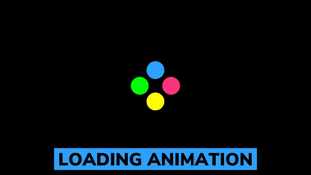
The pre-loader or loading animation that we are going to create today, its image is given on the webpage. In the image, we can see four color balls with different beautiful colors. Basically in this program, all balls are moves right-left and up-down with smooth animation.
To see the real demo of this loading animation you have to watch the video tutorial of this program that I have given below. I recommend you must watch this video tutorial of this program to get an idea of how all code works.
Tutorial of Loading Animation For Website using HTML & CSS
As you see on the given tutorial of preloader animation, There is a total of four balls, I have given the main div of balls CSS property position relative and to all balls CSS property absolute to positioned them up-down and right-left. The upper ball moves down, the lower ball moves up, same as right ball moves left side, and the left ball moves on the right side at the same time which looks beautiful isn’t it?
This is the easiest tutorial for those who have basic knowledge of HTML & CSS and they can easily make this loader, for those guys who are feeling difficulty to built this loading animation, I have provided all source code below.
You May Like This:
Loading Animation [Source Code]
To copy-paste the given code, first of all, you need to create two files on is an HTML file and another is a CSS file. After creating these two files you can copy-paste all codes in your document. You can also download all source code files from the given download button.
<!DOCTYPE html>
<!-- Created By CodingLab - www.codinglabweb.com -->
<html lang="en" dir="ltr">
  <head>
    <meta charset="UTF-8">
    <title> Loading Animation | CodingLab </title>
    <link rel="stylesheet" href="style.css">
   </head>
<body>
  <section>
    <div class="loader">
      <div class="upper ball"></div>
      <div class="right ball"></div>
      <div class="lower ball"></div>
      <div class="left ball"></div>
    </div>
  </section>

</body>
</html>
*{
  margin: 0;
  padding: 0;
  box-sizing: border-box;
}
section{
  display: flex;
  height: 100vh;
  width: 100%;
  background: #000;
  align-items: center;
  justify-content: center;
}
.loader{
  height: 25px;
  width: 25px;
  position: relative;
  animation: rotate 5s  infinite;
}
.ball{
  position: absolute;
  height: 25px;
  width: 25px;
  border-radius: 50%;
  box-shadow: 0 5px 10px rgba(0, 0, 0, 0.1);
}
.upper{
  left: 0;
  top: -22px;
  background: #2da2ff;
  animation: upper 1s linear infinite;
}
@keyframes upper {
  50%{
    top: 22px;
  }
  100%{
    top: 22px;
  }
}
.right{
  right: -22px;
  top: 0;
  background: #ff337a;
  animation: right 1s linear infinite;
}
@keyframes right {
  50%{
    right: 22px;
  }
  100%{
    right: 22px;
  }
}
.lower{
  bottom: -22px;
  left: 0;
  background: #ffff00;
  animation: lower 1s linear infinite;
}
@keyframes lower {
  50%{
    bottom: 22px;
  }
  100%{
    bottom: 22px;
  }
}
.left{
  left: -22px;
  top: 0;
  background: #00ff00;
  animation: left 1s linear infinite;
}
@keyframes left {
  50%{
    left: 22px;
  }
  100%{
    left: 22px;
  }
}


