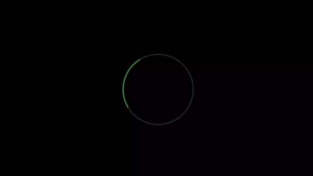
Hello readers, Today in this blog you’ll learn how to create a Circle Loader with Check-mark Animation using only HTML & CSS. Earlier I have shared a blog on how to create a Color Changing Shiny Loader using HTML & CSS. That loader is the same as this loader but there is no check-mark animation on that loader. But in this program, there is a check-mark animation.
Preloaders (also known as loaders) are what you see on the screen while the rest of the page’s content is still loading. Loaders are simple or complex animations that used to keep your visitors and content viewers entertained while the page’s content is still loading.
In this program (Circle Loader with Check-mark Animation), this loader rotates 360deg infinitely with changing its border-color at a certain time but when you click on this loader, this loader stops rotating and there is shown a check-mark icon with smooth animation which indicates that the loading process has been completed.
If you’re feeling difficult to understand what I am saying. You can watch a full video tutorial on this program (Circle Loader with Check-mark Animation).
Video Tutorial of Circle Loader with Check-mark Animation
In the video, you have seen the color-changing loader with checkmark animation. Generally, whenever we want the click animation we used the JavaScript click event function but in this program, I’ve used an HTML input type checkbox tag to create click animation and control this checkbox with the label tag as you’ve seen in the video.
If you like this program (Circle Loader with Check-mark Animation) and want to get source codes. You can easily get the source codes of this program. To get the source codes you just need to scroll down. You can use this program on your projects, websites, and HTML pages.
You might like this:
Circle Loader with Check-mark Animation [Source Codes]
To create this program (Circle Loader with Check-mark Animation). First, you need to create two Files one HTML File and another one is CSS File. After creating these files just paste the following codes in your file.
First, create an HTML file with the name of index.html and paste the given codes in your HTML file. Remember, you’ve to create a file with .html extension.
<!DOCTYPE html>
<!-- Created By CodingNepal -->
<html lang="en" dir="ltr">
   <head>
      <meta charset="utf-8">
      <title>Loader with Checkmark Animation | CodingNepal</title>
      <link rel="stylesheet" href="style.css">
   </head>
   <body>
      <input type="checkbox" id="check">
      <label for="check">
         <div class="check-icon"></div>
      </label>
   </body>
</html>
Second, create a CSS file with the name of style.css and paste the given codes in your CSS file. Remember, you’ve to create a file with .css extension.
@import url('https://fonts.googleapis.com/css?family=Poppins:400,500,600,700&display=swap');
*{
  margin: 0;
  padding: 0;
  box-sizing: border-box;
  font-family: 'Poppins', sans-serif;
}
html,body{
  display: grid;
  height: 100%;
  place-items: center;
  background: #000;
}
label{
  position: relative;
  height: 125px;
  width: 125px;
  display: inline-block;
  border: 2px solid rgba(255,255,255,0.2);
  border-radius: 50%;
  border-left-color: #5cb85c;
  animation: rotate 1.2s linear infinite;
}
@keyframes rotate {
  50%{
    border-left-color: #9b59b6;
  }
  75%{
    border-left-color: #e67e22;
  }
  100%{
    transform: rotate(360deg);
  }
}
label .check-icon{
  display: none;
}
label .check-icon:after{
  position: absolute;
  content: "";
  top: 50%;
  left: 28px;
  transform: scaleX(-1) rotate(135deg);
  height: 56px;
  width: 28px;
  border-top: 4px solid #5cb85c;
  border-right: 4px solid #5cb85c;
  transform-origin: left top;
  animation: check-icon 0.8s ease;
}
@keyframes check-icon {
  0%{
    height: 0;
    width: 0;
    opacity: 1;
  }
  20%{
    height: 0;
    width: 28px;
    opacity: 1;
  }
  40%{
    height: 56px;
    width: 28px;
    opacity: 1;
  }
  100%{
    height: 56px;
    width: 28px;
    opacity: 1;
  }
}
input{
  display: none;
}
input:checked ~ label .check-icon{
  display: block;
}
input:checked ~ label{
  animation: none;
  border-color: #5cb85c;
  transition: border 0.5s ease-out;
}
That’s all, now you’ve successfully created a Circle Loader with Check-mark Animation using only HTML & CSS. If your code doesn’t work or you’ve faced any error/problem then please comment down or contact us from the contact page.


