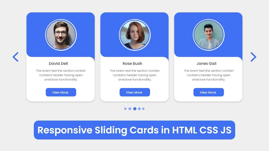
Hello buddy, I hope you are doing great. Today in this blog, you will learn to create a Responsive Card Slider in HTML CSS & JavaScript with SwiperJs. The card slider will have pagination, navigation buttons, and grab-to-slide. Earlier I created Sliding Card but it was suitable for only large-sized screens. But today’s project will be fully responsive with some advanced features.
A card slider means the combination of cards aligned horizontally and has a feature to slide to watch the hidden cards. The card can contain any content. Like profile cards, e-commerce product cards, blogs card, and others.
Look at the given image of our product [Responsive Card Slider] on the screen. As you can see in the preview, we can see three cards with some images, text content, and buttons. On the right and left sides we can see two navigation buttons and at the center, we can see pagination.
Actually, there are a total of nine cards but expect three are in hidden condition. To see the other card we need to click on any nav button or we can grab a card and slide it. The pagination also functions and we can also click on them to bring the next card.
I have provided a video tutorial below for the virtual experience of this project [Responsive Card Slider]. By watching the video tutorial, you can see the real demo of this project and obviously get the idea of how all HTML CSS, and JavaScript code work behind this project.
Responsive Card Slider in HTML CSS & JavaScript | Video Tutorial
I have provided all the HTML CSS and JavaScript code with the swiper js file that I have used to create this responsive card slider. Before getting into the source code file you need to familiarize yourself a little bit with the video tutorial on the card slider.
As you have seen in the video tutorial. At first, we have seen three cards with a navigation button and pagination. When I clicked on the left nav button the card slid left side and a hidden card appeared. When I clicked on the left navigation button, the cards slid right side. The pagination also showed us the active card with its indicator. To create all the UI designs of the card, I used HTML and CSS, and to make card slides I used the swiper js plugin.
I hope now you can build this card slider by using HTML CSS and JavaScript with the Swiper Js plugin. If you are feeling difficulty building this card slider, I have provided all the source codes below.
You Might Like This:
Card Slider | Card Carousel [Source Code]
To get the following HTML CSS and JavaScript code for a Card Slider. You need to create three files, HTML, CSS, and JavaScript file. After creating these three files then you can copy-paste the given codes on your document. You can also download all source code files from the given download button.
Download the images folder from Google Drive and put this folder inside the project folder. This folder has all the images that will be used for this slider.
<!DOCTYPE html>
<!-- Coding By CodingNepal - codingnepalweb.com -->
    <html lang="en">
    <head>
        <meta charset="UTF-8">
        <meta http-equiv="X-UA-Compatible" content="IE=edge">
        <meta name="viewport" content="width=device-width, initial-scale=1.0">
        <title>Responsive Card Slider</title>

        <!-- Swiper CSS -->
        <link rel="stylesheet" href="css/swiper-bundle.min.css">

        <!-- CSS -->
        <link rel="stylesheet" href="css/style.css">

    </head>
    <body>
        <div class="slide-container swiper">
            <div class="slide-content">
                <div class="card-wrapper swiper-wrapper">
                    <div class="card swiper-slide">
                        <div class="image-content">
                            <span class="overlay"></span>

                            <div class="card-image">
                                <!--<img src="images/profile1.jpg" alt="" class="card-img">-->
                            </div>
                        </div>

                        <div class="card-content">
                            <h2 class="name">David Dell</h2>
                            <p class="description">The lorem text the section that contains header with having open functionality. Lorem dolor sit amet consectetur adipisicing elit.</p>

                            <button class="button">View More</button>
                        </div>
                    </div>
                    <div class="card swiper-slide">
                        <div class="image-content">
                            <span class="overlay"></span>

                            <div class="card-image">
                                <!--<img src="images/profile2.jpg" alt="" class="card-img">-->
                            </div>
                        </div>

                        <div class="card-content">
                            <h2 class="name">David Dell</h2>
                            <p class="description">The lorem text the section that contains header with having open functionality. Lorem dolor sit amet consectetur adipisicing elit.</p>

                            <button class="button">View More</button>
                        </div>
                    </div>
                    <div class="card swiper-slide">
                        <div class="image-content">
                            <span class="overlay"></span>

                            <div class="card-image">
                                <!--<img src="images/profile3.jpg" alt="" class="card-img">-->
                            </div>
                        </div>

                        <div class="card-content">
                            <h2 class="name">David Dell</h2>
                            <p class="description">The lorem text the section that contains header with having open functionality. Lorem dolor sit amet consectetur adipisicing elit.</p>

                            <button class="button">View More</button>
                        </div>
                    </div>
                    <div class="card swiper-slide">
                        <div class="image-content">
                            <span class="overlay"></span>

                            <div class="card-image">
                                <!--<img src="images/profile4.jpg" alt="" class="card-img">-->
                            </div>
                        </div>

                        <div class="card-content">
                            <h2 class="name">David Dell</h2>
                            <p class="description">The lorem text the section that contains header with having open functionality. Lorem dolor sit amet consectetur adipisicing elit.</p>

                            <button class="button">View More</button>
                        </div>
                    </div>
                    <div class="card swiper-slide">
                        <div class="image-content">
                            <span class="overlay"></span>

                            <div class="card-image">
                                <!--<img src="images/profile5.jpg" alt="" class="card-img">-->
                            </div>
                        </div>

                        <div class="card-content">
                            <h2 class="name">David Dell</h2>
                            <p class="description">The lorem text the section that contains header with having open functionality. Lorem dolor sit amet consectetur adipisicing elit.</p>

                            <button class="button">View More</button>
                        </div>
                    </div>
                    <div class="card swiper-slide">
                        <div class="image-content">
                            <span class="overlay"></span>

                            <div class="card-image">
                                <!--<img src="images/profile6.jpg" alt="" class="card-img">-->
                            </div>
                        </div>

                        <div class="card-content">
                            <h2 class="name">David Dell</h2>
                            <p class="description">The lorem text the section that contains header with having open functionality. Lorem dolor sit amet consectetur adipisicing elit.</p>

                            <button class="button">View More</button>
                        </div>
                    </div>
                    <div class="card swiper-slide">
                        <div class="image-content">
                            <span class="overlay"></span>

                            <div class="card-image">
                                <!--<img src="images/profile7.jpg" alt="" class="card-img">-->
                            </div>
                        </div>

                        <div class="card-content">
                            <h2 class="name">David Dell</h2>
                            <p class="description">The lorem text the section that contains header with having open functionality. Lorem dolor sit amet consectetur adipisicing elit.</p>

                            <button class="button">View More</button>
                        </div>
                    </div>
                    <div class="card swiper-slide">
                        <div class="image-content">
                            <span class="overlay"></span>

                            <div class="card-image">
                                <!--<img src="images/profile8.jpg" alt="" class="card-img">-->
                            </div>
                        </div>

                        <div class="card-content">
                            <h2 class="name">David Dell</h2>
                            <p class="description">The lorem text the section that contains header with having open functionality. Lorem dolor sit amet consectetur adipisicing elit.</p>

                            <button class="button">View More</button>
                        </div>
                    </div>
                    <div class="card swiper-slide">
                        <div class="image-content">
                            <span class="overlay"></span>

                            <div class="card-image">
                                <!--<img src="images/profile9.jpg" alt="" class="card-img">-->
                            </div>
                        </div>

                        <div class="card-content">
                            <h2 class="name">David Dell</h2>
                            <p class="description">The lorem text the section that contains header with having open functionality. Lorem dolor sit amet consectetur adipisicing elit.</p>

                            <button class="button">View More</button>
                        </div>
                    </div>
                </div>
            </div>

            <div class="swiper-button-next swiper-navBtn"></div>
            <div class="swiper-button-prev swiper-navBtn"></div>
            <div class="swiper-pagination"></div>
        </div>

    </body>

    <!-- Swiper JS -->
      <script src="js/swiper-bundle.min.js"></script>

    <!-- JavaScript -->
    <script src="js/script.js"></script>
</html>
/* Google Fonts - Poppins */
@import url('https://fonts.googleapis.com/css2?family=Poppins:wght@300;400;500;600&display=swap');

*{
  margin: 0;
  padding: 0;
  box-sizing: border-box;
  font-family: 'Poppins', sans-serif;
}
body{
  min-height: 100vh;
  display: flex;
  align-items: center;
  justify-content: center;
  background-color: #EFEFEF;
}
.slide-container{
  max-width: 1120px;
  width: 100%;
  padding: 40px 0;
}
.slide-content{
  margin: 0 40px;
  overflow: hidden;
  border-radius: 25px;
}
.card{
  border-radius: 25px;
  background-color: #FFF;
}
.image-content,
.card-content{
  display: flex;
  flex-direction: column;
  align-items: center;
  padding: 10px 14px;
}
.image-content{
  position: relative;
  row-gap: 5px;
  padding: 25px 0;
}
.overlay{
  position: absolute;
  left: 0;
  top: 0;
  height: 100%;
  width: 100%;
  background-color: #4070F4;
  border-radius: 25px 25px 0 25px;
}
.overlay::before,
.overlay::after{
  content: '';
  position: absolute;
  right: 0;
  bottom: -40px;
  height: 40px;
  width: 40px;
  background-color: #4070F4;
}
.overlay::after{
  border-radius: 0 25px 0 0;
  background-color: #FFF;
}
.card-image{
  position: relative;
  height: 150px;
  width: 150px;
  border-radius: 50%;
  background: #FFF;
  padding: 3px;
}
.card-image .card-img{
  height: 100%;
  width: 100%;
  object-fit: cover;
  border-radius: 50%;
  border: 4px solid #4070F4;
}
.name{
  font-size: 18px;
  font-weight: 500;
  color: #333;
}
.description{
  font-size: 14px;
  color: #707070;
  text-align: center;
}
.button{
  border: none;
  font-size: 16px;
  color: #FFF;
  padding: 8px 16px;
  background-color: #4070F4;
  border-radius: 6px;
  margin: 14px;
  cursor: pointer;
  transition: all 0.3s ease;
}
.button:hover{
  background: #265DF2;
}

.swiper-navBtn{
  color: #6E93f7;
  transition: color 0.3s ease;
}
.swiper-navBtn:hover{
  color: #4070F4;
}
.swiper-navBtn::before,
.swiper-navBtn::after{
  font-size: 35px;
}
.swiper-button-next{
  right: 0;
}
.swiper-button-prev{
  left: 0;
}
.swiper-pagination-bullet{
  background-color: #6E93f7;
  opacity: 1;
}
.swiper-pagination-bullet-active{
  background-color: #4070F4;
}

@media screen and (max-width: 768px) {
  .slide-content{
    margin: 0 10px;
  }
  .swiper-navBtn{
    display: none;
  }
}
var swiper = new Swiper(".slide-content", {
    slidesPerView: 3,
    spaceBetween: 25,
    loop: true,
    centerSlide: 'true',
    fade: 'true',
    grabCursor: 'true',
    pagination: {
      el: ".swiper-pagination",
      clickable: true,
      dynamicBullets: true,
    },
    navigation: {
      nextEl: ".swiper-button-next",
      prevEl: ".swiper-button-prev",
    },

    breakpoints:{
        0: {
            slidesPerView: 1,
        },
        520: {
            slidesPerView: 2,
        },
        950: {
            slidesPerView: 3,
        },
    },
  });
If you face any difficulties while creating your card slider or your code is not working as expected, you can download the source code files for this card slider for free by clicking on the download button, and you can also view a live demo of this card slider by clicking on the view live button.


