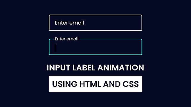
When you come to fill out a form, you may have seen there is an amazing Floating Label Animation. If you are looking for a quick and easy way to create CSS Input Label Animation then this blog is written for you.
This blog will teach you how to create an Input Label Animation using HTML and CSS only. This type of animation typically appears when we click on an input field to enter some information. In my recent blog post, I have provided 10 Free Responsive Navigation Bar, which could also enhance your skills in HTML CSS as well as JavaScript.
The float label pattern floats the inline label up above the input after the user focuses on the form field or enters a value.This method is much more space-saving than the conventional heading in front of a form field.
Have a quick look at the given image of my Input Label Animation. As you can see on this Floating Label Animationin the first input field there is an input box and inside it there is a label and you can see in the second input box that the label has gone up when the input box is in focus.
If you’re wondering how this input label animation truly works, take a look at the preview provided below. I have explained all the HTML and CSS code that I have used to create this Input Label Animation.
Input Label Animation in HTML & CSS | Video Tutorial
All of the HTML and CSS code that I used to create this Floating Label Animation is provided. Instead of duplicating the code or downloading the source code file, I strongly advise you to watch the full video explanation of this Input Label Animation. By watching the video tutorial, you can create this Input Label Animation.
As you have seen in the video tutorial of this Input Label Animation. Basically, it’s an input with a lot of CSS effects. As you have seen when I click inside it, the label goes up left, and when we write something on the input, label stays on top, but when we clear the input box, the label come to its original position.
Now, hopefully, you can create this Input Label Animation using HTML and CSS. The source codes for all the HTML and CSS I used to develop this Input Label Animation are provided below.
You May Like This Video:
- Email Validation in HTML CSS & JS
- Elastic Tab Animation in HTML & CSS
- Floating Label Animation in HTML & CSS
- Show & Hide Password in HTML CSS & JS
Input Label Animation in HTML & CSS [Source Codes]
- Create a folder. You can name this folder whatever you want, and inside this folder, create the mentioned files.
- Create an
index.htmlfile. The file name must be index and its extension .html - Create a
style.cssfile. The file name must be style and its extension .css - Create a
script.jsfile. The file name must be script and its extension .js
Once you create these files, paste the given codes into the specified files. If you don’t want to do these then scroll down and download the an Input Label Animation by clicking on the given download button.
First, paste the following codes into your index.html file.
<!DOCTYPE html>
<!-- Coding By CodingNepal - codingnepalweb.com -->
<html lang="en">
<head>
  <meta charset="UTF-8">
  <meta name="viewport" content="width=device-width, initial-scale=1.0">
  <meta http-equiv="X-UA-Compatible" content="ie=edge">
  <title>Input Label Animaton | CoderGirl</title>
  <!---Custom CSS File--->
  <link rel="stylesheet" href="style.css">
</head>
<body>
  <div class="input-field">
    <input type="text" required spellcheck="false">
    <label>Enter email</label>
  </div>
</body>
</html>
Second, paste the following codes into your style.css file.
/* Import Google font - Poppins */
@import url('https://fonts.googleapis.com/css2?family=Poppins:wght@200;300;400;500;600;700&display=swap');
*{
  margin: 0;
  padding: 0;
  box-sizing: border-box;
  font-family: 'Poppins', sans-serif;
}
body{
  min-height: 100vh;
  display: flex;
  align-items: center;
  justify-content: center;
  background-color: #060b23;
}
.input-field{
  position: relative;
}
.input-field input{
   width: 350px;
  height: 60px;
  border-radius: 6px;
  font-size: 18px;
  padding: 0 15px;
  border: 2px solid #fff;
  background: transparent;
  color: #fff;
  outline: none;
}
.input-field label{
  position: absolute;
  top: 50%;
  left: 15px;
  transform: translateY(-50%);
  color: #fff;
  font-size: 19px;
  pointer-events: none;
  transition: 0.3s;
}
input:focus{
  border: 2px solid #18ffff;
}
input:focus ~ label,
input:valid ~ label{
  top: 0;
  left: 15px;
  font-size: 16px;
  padding: 0 2px;
  background: #060b23;
}
That’s all, now you’ve successfully created a project on an Input Label Animation. If your code doesn’t work or you’ve faced any problems, please download the source code files from the given download button. It’s free and a zip file containing the project folder with source code files will be downloaded.


