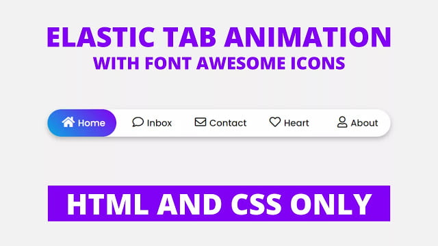
Hello readers, Today in this blog you’ll learn how to create an Elastic Active Tab Animation using only HTML & CSS. Earlier I’ve shared a blog on how to create an Active Tab Hover Animation using HTML & CSS and that design is similar but this design is a little bit advanced and attractive that means this design has an elastic active tab animation.
The menu bar is where visitors find links to the important pages on your website. And the tabs are perfect for single-page web applications, or for displaying different topics in a smaller area. Today you will learn to create an Elastic Tab Animation using only HTML & CSS.
In this program, there is a menu bar on the webpage with five different menu icons with the texts. But when you click on the particular menu item, there is shown an Elastic Tab Animation which is filled with the gradient background color. You may have seen this type of animation somewhere, there is a used JavaScript or JavaScript library but this is a pure CSS program that’ means I used only HTML & CSS to create this animation.
If you’re feeling difficult to understand what I am saying. You can watch a full video tutorial on this program (Elastic Tab Animation).
Video Tutorial of an Elastic Active Tab Animation
In the video, you have seen an elastic active tab animation that is created using only HTML & CSS. And I hope you’ve understood the basic codes behind creating this animation. This is a simple CSS program so if you’re a beginner in web designing and you know basic HTML & CSS then you can easily understand the codes of the program.
If you like this program (Elastic Tab Animation) and want to get source codes. You can easily get the source codes of this program. To get the source codes you just need to scroll down. You can use this program on your projects and the website’s menu bar.
You might like this:
Elastic Active Tab Animation [Source Codes]
To create this program (Elastic Tab Animation). First, you need to create two Files one HTML File and another one is CSS File. After creating these files just paste the following codes in your file.
First, create an HTML file with the name of index.html and paste the given codes in your HTML file. Remember, you’ve to create a file with .html extension.
<!DOCTYPE html>
<!-- Created By CodingNepal -->
<html lang="en" dir="ltr">
   <head>
      <meta charset="utf-8">
      <title>Elastic Tab Animation | CodingNepal</title>
      <link rel="stylesheet" href="style.css">
      <link rel="stylesheet" href="https://cdnjs.cloudflare.com/ajax/libs/font-awesome/5.15.3/css/all.min.css"/>
   </head>
   <body>
      <div class="wrapper">
         <nav>
            <input type="radio" name="tab" id="home" checked>
            <input type="radio" name="tab" id="inbox">
            <input type="radio" name="tab" id="contact">
            <input type="radio" name="tab" id="heart">
            <input type="radio" name="tab" id="about">
            <label for="home" class="home"><a href="#"><i class="fas fa-home"></i>Home</a></label>
            <label for="inbox" class="inbox"><a href="#"><i class="far fa-comment"></i>Inbox</a></label>
            <label for="contact" class="contact"><a href="#"><i class="far fa-envelope"></i>Contact</a></label>
            <label for="heart" class="heart"><a href="#"><i class="far fa-heart"></i>Heart</a></label>
            <label for="about" class="about"><a href="#"><i class="far fa-user"></i>About</a></label>
            <div class="tab"></div>
         </nav>
      </div>
   </body>
</html>
Second, create a CSS file with the name of style.css and paste the given codes in your CSS file. Remember, you’ve to create a file with .css extension.
@import url('https://fonts.googleapis.com/css?family=Poppins:400,500,600,700&display=swap');
*{
  margin: 0;
  padding: 0;
  box-sizing: border-box;
  font-family: 'Poppins', sans-serif;
}
html,body{
  display: grid;
  height: 100%;
  place-items: center;
  text-align: center;
  background: #f2f2f2;
}
.wrapper{
  height: 60px;
  width: 55vw;
  background: #fff;
  line-height: 60px;
  border-radius: 50px;
  box-shadow: 0 5px 10px rgba(0,0,0,0.25);
}
.wrapper nav{
  position: relative;
  display: flex;
}
.wrapper nav label{
  flex: 1;
  width: 100%;
  z-index: 1;
  cursor: pointer;
}
.wrapper nav label a{
  position: relative;
  z-index: -1;
  color: #1d1f20;
  font-size: 20px;
  font-weight: 500;
  text-decoration: none;
  transition: color 0.6s ease;
}
.wrapper nav #home:checked ~ label.home a,
.wrapper nav #inbox:checked ~ label.inbox a,
.wrapper nav #contact:checked ~ label.contact a,
.wrapper nav #heart:checked ~ label.heart a,
.wrapper nav #about:checked ~ label.about a{
  color: #fff;
}
.wrapper nav label a i{
  font-size: 25px;
  margin: 0 7px;
}
.wrapper nav .tab{
  position: absolute;
  height: 100%;
  width: 20%;
  left: 0;
  bottom: 0;
  z-index: 0;
  border-radius: 50px;
  background: linear-gradient(45deg, #05abe0 0%,#8200f4 100%);
  transition: 0.6s cubic-bezier(0.68, -0.55, 0.265, 1.55);
}
.wrapper nav #inbox:checked ~ .tab{
  left: 20%;
}
.wrapper nav #contact:checked ~ .tab{
  left: 40%;
}
.wrapper nav #heart:checked ~ .tab{
  left: 60%;
}
.wrapper nav #about:checked ~ .tab{
  left: 80%;
}
.wrapper nav input{
  display: none;
}
That’s all, now you’ve successfully created an Elastic Active Tab Animation using only HTML & CSS. If your code doesn’t work or you’ve faced any error/problem then please comment down or contact us from the contact page.


